Showing posts with label show and tell. Show all posts

Wednesday, December 12, 2007

tick and tell

Yes, I finally succumbed to the pressure to edit the name "show and tell." I guess this title doesn't even make sense, since nothing is ticking, but I am keeping it anyway.

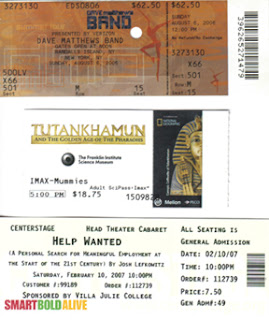
This week, I brought some samples of my ticket collection. Since I moved to the city and downsized my living space, tickets are the only thing I have the luxury to collect.

I especially enjoy tickets with holographic pieces or images. I begrudgingly save the Ticketmaster tickets, but the Internet tickets are an abomination and must only be saved as a last resort if I really need them as a concert memento.

Tuesday, December 4, 2007

spooktacular show and tell

For show and tell this week, I brought a sample of an invitation my roommate and I created. I've only been exposed to making handmade cards for a short while, but it is a fun hobby, and you have a lot of control over the product. It's a great idea to try for anyone who likes paper.

Monday, November 19, 2007

unnecessary instructions show and tell

Instructions on greeting card cellophane: Remove protective wrap before placing in envelope.
I coulda guessed that one.

Instructions on St. Ives Swiss Formula lotion: Smooth into skin as often as needed. Daily use will prevent over-dry skin from recurring.
Okay, so why else would you want lotion?

Thursday, November 15, 2007

definition

So, I didn't bring this one to class, because I am not sure of the rules on reading the Bible in state-funded institutions. But, anything goes in cyberspace, and this definition of love from 1 Corinthians 13 is, in my opinion, a beautiful piece of prose.

Love is patient, love is kind. It does not envy, it does not boast, it is not proud. It is not rude, it is not self-seeking, it is not easily angered, it keeps not record of wrongs. Love does not delight in evil, but rejoices with the truth. It always protects, always trusts, always hopes, always perseveres.
Love never fails.
(v. 4-8a)

Monday, November 5, 2007

narration show and tell

The Spider and The Fly

"Will you walk into my parlour?" said the Spider to the Fly,
"'Tis the prettiest little parlour that ever you did spy;
The way into my parlour is up a winding stair,
And I have many curious things to show you when you're there."

"Oh no, no," said the little Fly, "to ask me is in vain,
For who goes up your winding stair can ne'er come down again."

"I'm sure you must be weary, dear, with soaring up so high;
Will you rest upon my little bed?" said the Spider to the Fly.
"There are pretty curtains drawn around; the sheets are fine and thin,
And if you like to rest awhile, I'll snugly tuck you in!"

"Oh no, no," said the little Fly, "for I've often heard it said,
They never, never wake again, who sleep upon your bed!"

Said the cunning Spider to the Fly, " Dear friend what can I do,
To prove the warm affection I 've always felt for you?
I have within my pantry, good store of all that's nice;
I'm sure you're very welcome -- will you please to take a slice?"

"Oh no, no," said the little Fly, "kind Sir, that cannot be,
I've heard what's in your pantry, and I do not wish to see!"

"Sweet creature!" said the Spider, "you're witty and you're wise,
How handsome are your gauzy wings, how brilliant are your eyes!
I have a little looking-glass upon my parlour shelf,
If you'll step in one moment, dear, you shall behold yourself."

"I thank you, gentle sir," she said, "for what you 're pleased to say,
And bidding you good morning now, I'll call another day."

The Spider turned him round about, and went into his den,
For well he knew the silly Fly would soon come back again;
So he wove a subtle web, in a little corner sly,
And set his table ready, to dine upon the Fly.

Then he came out to his door again, and merrily did sing,
"Come hither, hither, pretty Fly, with the pearl and silver wing;
Your robes are green and purple -- there's a crest upon your head;
Your eyes are like the diamond bright, but mine are dull as lead!"

Alas, alas! how very soon this silly little Fly,
Hearing his wily, flattering words, came slowly flitting by:
With buzzing wings she hung aloft, then near and nearer drew --
Thinking only of her brilliant eyes, and green and purple hue,
Thinking only of her crested head -- poor foolish thing! At last,
Up jumped the cunning Spider, and fiercely held her fast.
He dragged her up his winding stair, into his dismal den,
Within his little parlour -- but she ne'er came out again!

And now dear little children, who may this story read,
To idle, silly flattering words, I pray you ne'er give heed:
Unto an evil counsellor, close heart and ear and eye,
And take a lesson from this tale, of the Spider and the Fly.

by Mary Howitt, 1821
Thursday, November 1, 2007

Paper Cutting Show and Tell


Although passersby glanced quizzically at my group cutting and pasting last Saturday, I found the paper cutting exercise helpful in increasing my awareness of the subject matter on the page. My group paid careful attention to the colors we used and the sizes of our shapes to convey meaning and mood.

Altering the colors and shapes of eyes and mouth indicated a transformation in the characters as much as the engorgement of the pumpkin did.

This project demonstrated the importance of making conscious design choices. Each element in the picture conveyed a meaning.
On antoher note, I included the cartoon above, because I thought the pumpkins were getting a little out of control. Peter needed to keep them in line.

Friday, October 26, 2007

typography show and tell

My first item for show and tell is an example of typography gone wrong. This postcard features four typefaces. The text is set with drop shadows, outlines, gradients, italics, and multiple colors. Some text is also tilted. Overall, it is just a mess.


My second item is an article from the September/October issue of good. It describes a Federal Highway Administration project to improve legibility of road signs and increase driver reaction time by switching to a new typeface. This typeface is more legible, so the signs can be read from farther away without increasing their size.

Typography is one of the most important choices in sign-making. The wrong typeface could make signs unusable. I often find it interesting to think about the standard typefaces used in federal and state signage on roads. Now I know that a lot of research goes into choosing the face for signs.


Sunday, October 14, 2007

raindrops on roses

These are a few of my favorite words:

Silly Words
waddle
wiggle
squiggle
gaggle

Sailing Words
flotsam
jettison
aft
fore
arrr!
a-lee
ho!
leeward
scuttlebutt

As you like it
phosphorescent
squalor
bashful
hilarity
splendor
contort
savor
savory
languish
lullaby
interject
fiasco
intermittent
squeamish
hop
subtle
dusk
sweep

Sound Words (onomatopoeia)
buzz
quack
gong
bassoon
crunch
crackle

Fake Curse Words and insults
Criminey!
Schnikeys!
Sucker monkey

Wednesday, October 10, 2007

classification show and tell


I toted a copy of Backpacker with me last Saturday for show and tell. Among many buying articles in the gear guide issue, there was an article on boots. Backpacker classified the trail/hiking boots were classified into three main categories: lightweight, midweight, and heavy-duty.
Each category contains multiple subcategories. Some of these are the same throughout (i.e. best value); others vary (i.e. top trail runner). Each section also contains a sidebar called "Reader Approved" in which a reader gives his or her opinion of a boot.
Each section also has a "gear school" sidebar. This sidebar gives 5-6 tips on a topic such as getting a good fit and preventing blisters.


The boots section finishes with comparison charts informing the reader of the features of many brands of boots.
Looking at the whole issue, I notice that the charts and sidebars appear for each type of gear throughout the issue. There is a larger classification at work in this issue. The boots section is subdivided, but overarching that subdivision, the entire guide is divided into types of gear, like boots, packs and tents. These items are listed across the top of the front cover in colored blocks. The color is brought inside and coordinates with the sections. It is used in the headings and in the outside margins as a thumbnail guide, but the colors do not bleed.
Classification overload!
This is a very useful guide for the gear shopper. I used it when purchasing a pair of boots this past summer.
Backpacker. March 2007

Wednesday, October 3, 2007

Call to Action Show and Tell

For our call to action assignment, I brought one of the more blatant call to action vehicles: a piece of direct mail. This mailing from Paralyzed Veterans of America calls the recipient to donate money by October 15th in order to meet a matching donation deadline. The envelope and letter are stamped with color messages and mock handwritten type encouraging the reader with statements like "I need to hear from you by October 15 -- please!"


An excerpt from the letter reads: "...if it happened to slip your mid...or you didn't receive my first letter...or if you've become distracted by all the hustle and bustle of everyday life...please take a moment to send the most generous gift you can manage."

The target audience for this piece is supporters of the organization. The letter seeks additional donations from people with a history of past support in order to raise funds to receive a matching grant.

A reply form with descriptions of the organization's work and business reply envelope are enclosed with the letter.

Direct mailing may not be as pretty as the glossy ads running in magazines, but it is much more effective at soliciting donations. In some ways, it is the ultimate call to action vehicle, reaching people by personal address without harassing them.

For information on Paralyzed Veterans of America, visit http://www.supportveterans.org/.

Wednesday, September 26, 2007

Description Show and Tell

Here follows the opening of "Pamplona in July," an essay by Ernest Hemmingway, published in 1923.


In Pamplona, a white-walled, sun-baked town high up in the hills of Navarre,
is held in the first two weeks of July each year the World's Series of bull
fighting.

Bull fight fans from all Spain jam into the little town. Hotels double
their prices and fill every room. The cafes under the wide arcades that
run around the Plaza de la Constitucion have every table crowded, the tall
Pilgrim Father sombreros of Andalusia sitting over the same table with straw
hats from Madrid and the flat blue Basque caps of Navarre and the Basque
country.

Really beautiful girls, gorgeous, bright shawls over their shoulders, dark,
dark-eyed, black lace mantillas over their hair, walk with their escorts in the
crowds that pass from morning until night along the narrow walk that runs
between inner and outer belts of cafe tables under the shade of the arcade out
of the white glare of the Plaza de la Constitucion. All day and all night
there is dancing in the streets. Bands of blue-shirted peasants whirl and
lift and swing behind a drum, fife and reed instruments in the ancient Basque
Riau-Riau dances. And at night, there is the throb of the big drums and
the military band as the whole town dances in the great open square of the
Plaza.


Here, Hemmingway places us, so we are ready to hear his tale. We can see the people, the crowd, the color, the dancing. I especially like his method of describing
people by the hats they wear in the second paragraph. This not only gives us a picture of the scene, it also demonstrates the unity spurred by this event. Different people from all parts of Spain (and beyond, since Hemingway is American) have
crowded into this town for the spectacle of the bull running.

Sunday, September 16, 2007

Inspiration Show and Tell

Here are two pieces that inspire me, both because of the words and the writers:

1. "The difference between the right word and the almost right word is the difference between lightning and the lightning bug." -- Mark Twain

I enjoy this quip. It's direct, it's clever, and it illustrates his point well. I can always use a reminder of the importance of word choice.

2.
"Our deepest fear is not that we are inadequate.
Our deepest fear is that we are powerful beyond measure.
It is our Light, not our Darkness that most frightens us.
We ask ourselves...Who am I to be brilliant, gorgeous, talented, fabulous?
Actually, who are you NOT to be?
There is nothing enlightened about shrinking so that other people won't feel insecure around you.
We were born to make manifest the glory of God that is within us.
It is not just in some of us; it is in everyone.
And as we let our own Light shine, we unconsciously give others permission to do the same.
As we are liberated from our own fear, our presence automically liberates others."
from Nelson Mandela's inaugural address, 1994

Nelson Mandela inspires me. I read his autobiography Long Walk to Freedom about five years ago. It is a lengthy book, but worth every page. Mandela fought to uphold his ideals and remain true to his beliefs despite years of hardship and imprisonment. This passage from his inaugural address is particularly meaningful to me. I first received it from a friend who thought of me when he read it. It is the message behind the words in this passage that affect me the most, but also from a literary perspective, the balance in the last few lines is very appealing. All in all, I find it absolutely beautiful and it is one of my favorite excerpts.